The Science of Visible Light and Its Impact on Paint Specification


Light Reflectance Value (LRV)
An important consideration when selecting paint is the paint’s light reflectance value, or LRV. This figure represents the total quantity of visible and usable light reflected by a surface at all wavelengths and in all directions. Put another way, LRV measures how much light a surface reflects and how much light it absorbs.
LRV is largely dependent on color. This quality is measured as a percentage from 0 to 100, where zero is absolute black and 100 percent is perfectly reflective white. In reality, the most absorbing black has an LRV of about 5 percent, and an extremely reflective white has an LRV of about 90 percent.
LRV has important implications for daylighting and energy use. Dark colors absorb more light and heat; consequently, spaces painted with darker colors may require more artificial light to light them. They may also require more cooling energy or less heating energy, depending on the building location, orientation, and other factors. If heat gain is a concern, a good rule of thumb is to choose colors with an LRV of 60 and higher.
Lighter colors reflect more light back into the room and absorb less heat. A color with a high LRV will contribute most to daylighting and can reduce reliance on artificial light sources. Naturally, whites have high LRV values, but colors in the yellow family can achieve LRVs of up to 80–90 percent. An important consideration is that yellow grows exponentially more intense the more area it covers.
Knowing the color’s LRV can help the designer ensure adequate illumination for tasks and general lighting. LRV can also help delineate spaces and highlight hazards by optimizing contrast. Designers can often find the LRV of a paint color on the opposite side of the fan deck or through the manufacturer’s website.
Importantly, LRV is an invaluable tool for creating successful lighting plans that optimize daylighting and reduce reliance on artificial lighting. Commercial spaces such as auditoriums, classrooms, banks, lobbies, museums, and restaurants have a suggested LRV of about 70 percent. Industrial spaces such as warehouses, manufacturing, and shipping facilities have a suggested LRV of 65 percent.
The American Society of Heating, Refrigerating and Air-Conditioning Engineers (ASHRAE) also recommends minimum reflectance values for interior ceilings, walls, and flooring for various building types. The ceiling is the most important light-reflecting surface; hence, the recommended reflectance values are high at 80 percent or more. Reflectance values should be at least 50 percent for walls and at least 20 percent for floors.
Reflectance and Paint Sheen
The type of finish on the paint affects how light is reflected from a surface. This in turn impacts how light is distributed within a space—and ultimately, how we experience it.
Think about a glossy versus a matte finish. The glossy surface will have more variation, with highlights that appear white or nearly so, while the matte surface will have a more uniform color.
To understand why this is, it is helpful to understand the two main types of reflection: specular and diffuse.
Specular reflection is the mirror-like reflection of light from a surface. Incoming light from a single direction reflects off the surface in a single outgoing direction. Satin, semi-gloss, and gloss sheens produce specular reflection.
Specular reflection creates highlights on glossy surfaces, especially those with texture and “topography,” like molding. While specular reflection tends to make surfaces more interesting, it can also induce glare, which can cause fatigue and eyestrain.
Diffuse reflection occurs when incoming light is reflected in many directions. Matte, flat, and eggshell paint sheens produce diffuse reflections.
Diffuse reflection makes surfaces appear matte and uniform. This type of effect tends to obscure surface defects and can help contain glare; however, it creates a more monotonous painted surface.
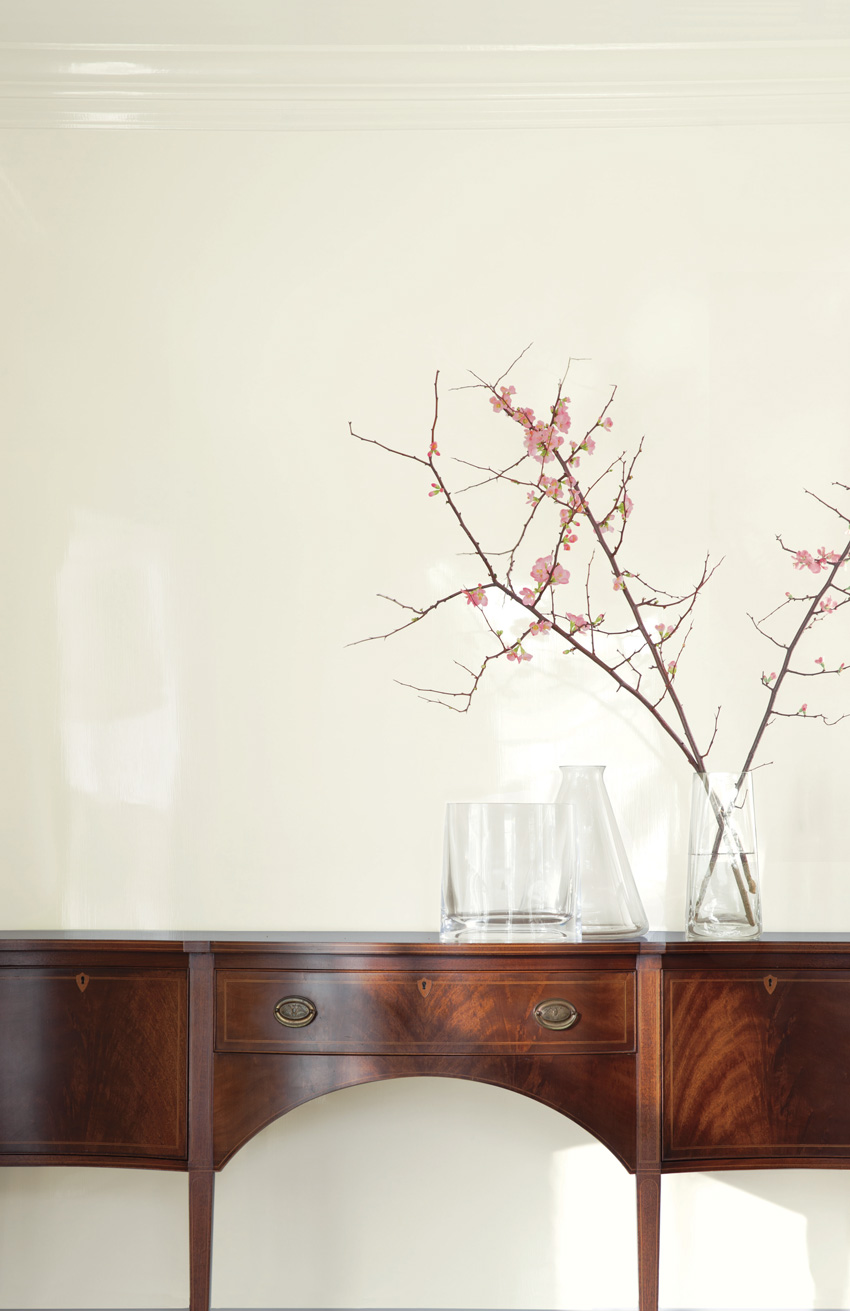
Are the wall and molding colors the same? Note the white highlights on the molding, which is finished with a glossier sheen than the walls.
Impact of Sheen on Color Perception
Because of the way light reacts to glossy surfaces, light colors can appear lighter, and dark colors can appear darker in glossy sheens. Intuitively, it makes sense that the highlights in a glossy finish can make the color appear lighter. With darker colors, there is a greater contrast between the lighter highlights and the rest of the surface where light is not reflected. The overall effect is for the color to appear darker.
To summarize:
- Matt, flat, and eggshell tend to produce a diffuse reflection.
- Satin, semi-gloss, and gloss will produce a specular reflection.
- Darker colors may appear darker in higher sheens.
Requesting a Drawdown
Sheen is a quality of paint that impacts not only its appearance and durability but also how colors are represented. Typically, color chips are produced using an eggshell finish; however, the same color can appear lighter or darker in a glossy finish. If a project calls for a glossy finish, it is advisable to sample the paint color in the desired sheen to ensure the color is right.
Design professionals can request drawdowns to get a good idea of what the paint will look like in a given space with a certain type of lighting. A drawdown is a sample of paint from the actual color and sheen specified for the job. Drawdown cards usually measure 8 inches by 11 inches and are made by placing a small amount of paint on a plastic card and spreading it using a metal bar. This method eliminates distracting brush strokes and ensures consistent coverage.
Metamerism
An important consideration when selecting paint is a phenomenon called metamerism. Metamerism occurs when two colors that look identical under one light source look different from each other under another.
Metamerism occurs because the SPD of these apparently identical colors are different. When two such colors are plotted on a graph showing relative reflectance across all wavelengths, the curves will overlap if they are non-metameric, but they will cross or intersect at least three times if they are metameric.
Metameric matches, or pairs, are quite common, especially in near neutrals, grays, gray-blues, gray-greens, and mauve, and the differences can be surprisingly dramatic.
Metamerism typically occurs when matching two colors that are made of different materials—for instance, paint and fabric. This occurs because the paint is colored with pigments, while the fabric relies on dyes.
Recall that colors can be created using additive (light) mixing or subtractive (substance) mixing. Blending pigments is different than mixing inks for printed material or using light to create colors on a computer screen.
Evaluating Paint Color and Ensuring Consistency
Metamerism is a key reason to evaluate color chips under various lighting conditions, including natural daylight and different types of artificial light. Manufacturer color chips are typically produced using an eggshell finish, as this finish is less prone to glare and provides an accurate rendition of a color.
Professional paint retailers typically equip their stores with state-of-the-art lighting technology and light boxes that enable a customer to view paint chips under various lighting conditions.
To properly evaluate color, specular reflection must be eliminated. This is accomplished by viewing color at an angle—ideally, 45 degrees from horizontal. This angle ensures only diffuse reflection is seen. It also eliminates glare, which can distort color.
When color standards are viewed in the lab under specialized lighting in a light box, a stand is used to hold a drawdown on a 45-degree angle to improve color-viewing accuracy.
A key point to remember is that color formulas are not the same across manufacturers. For example, one manufacturer may use more green in its formula while another may use more blue. The undertones in the colorant are impacted by the changing light source.
In addition to the range in color formulas, product composition varies from manufacturer to manufacturer. For example, some colorants are made from solvents, which are paint thinners; others are made with waterborne technology. Such resins improve durability and hide without contributing volatile organic compounds, or VOCs.
For these reasons, it is recommended that design professionals indicate on their specification or contractor instructions that product substitutions are unacceptable. This is the best way to ensure that the end result is exactly what the designer or architect intended.
There is more than one way to make the same color. Paint color prescriptions and colorants vary from manufacturer to manufacturer. Some use proprietary colorant systems, while others rely on third-party sources.
Recall that paints exhibit a mass tone, or dominant tone, and undertone. Examine two seemingly identical colors from two different manufacturers, and you may find that one adds more red, while the other adds more yellow. This difference only becomes apparent once the paint is applied and the light source illuminates the surface. The CCT of the light source effects the undertones in the colorants and may cause a color shift.
Another factor that impacts the tinted color is the quality of the base paint, or the paint before it is tinted. Base paints vary; some are slightly gray or yellow, while others are white. The quality of the base paint also impacts the quantity and distribution of colorant that is used to create the tinted color. (For paint compositions, refer to the Pigments and Colorants sidebar earlier in the article.)
