The Science of Visible Light and Its Impact on Paint Specification


Learning Objectives:
- Describe the visible light spectrum, including how the human eye sees and how the brain interprets color.
- Explain how correlated color temperature (CCT), color rendering index (CRI), and spectral power distribution (SPD) impact the quality and color of light.
- Distinguish the CCT and CRI of different artificial light sources, and describe their affects on color.
- Discuss trends in lighting technology that allow users to choose and change color temperature and other lighting characteristics.
- Provide examples of how design professionals can use their knowledge of light to help specify paint color and sheen.
Credits:
This course is approved as a Structured Course
This course can be self-reported to the AANB, as per their CE Guidelines
Approved for structured learning
Approved for Core Learning
This course can be self-reported to the NLAA
Course may qualify for Learning Hours with NWTAA
Course eligible for OAA Learning Hours
This course is approved as a core course
This course can be self-reported for Learning Units to the Architectural Institute of British Columbia
It might seem like an obvious statement, but without light, there would be no color. However, perhaps less obvious to most is the impact that certain types of light have on the colors that we perceive.

All images courtesy of Benjamin Moore & Co.
The type of light that illuminates a room or surface greatly impacts how we perceive the color.
The Science of Light
Think about how a human face appears when illuminated by early morning light. No matter what the color of skin, it will appear warm and soft. This same face in the midday sun will be marked with harsh, contrasting shadows, and the skin tones will appear cooler. Now imagine how this same face appears when bathed in candlelight versus a conventional fluorescent fixture. While candlelight is kind to most of us, under the fluorescent fixture, human skin often takes on a sallow greenish cast.
The colors that we perceive are determined in part by the quality and quantity of the light that illuminates them, whether it be natural, artificial, or a combination of both.
For millennia, humans relied solely on the sun or firelight. Today, of course, artificial lighting illuminates our world day and night. We lived with the incandescent, or Edison bulb, for more than 100 years. Today, several types of artificial lighting systems, each with its own unique characteristics and impacts on color, illuminate our buildings. Light-emitting diodes, or LEDs, are quickly replacing other types of lighting in both new and existing buildings.
Because light has such a profound impact on color perception, design professionals should ideally have a foundational understanding of how lighting choices will impact paint color and finish selections for their projects. For this, we must first look at the nature of light itself.
The Electromagnetic Spectrum
Light is composed of many wavelengths of energy. The full range of these frequencies is called the electromagnetic spectrum. Only a small portion of these wavelengths are visible to the human eye. This narrow band is known as the visible light spectrum, and it includes all of the colors of the rainbow.
The visible light spectrum includes wavelengths ranging from 780–390 nanometers (nm). For comparison, UV light ranges from 10–400 nm, and X-rays are shorter still. Specific wavelengths correspond to specific colors. Reds have the longest wavelength and range from 650–700 nm. Cooler colors have shorter wavelengths. The violets have the shortest wavelengths of all and range from 390–430 nm.
Warmer, longer wavelengths are easier to see in dim light, while cooler colors tend to disappear. This concept is important to remember when we discuss the impact of light on paint color.
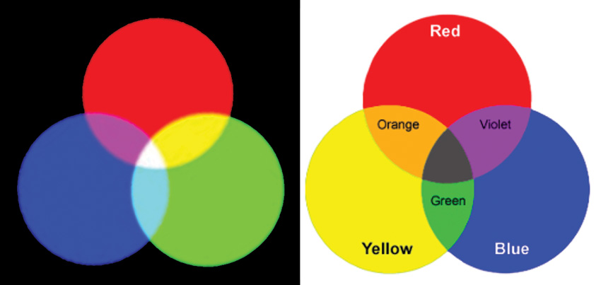
Additive mixing (left) involves the mixing of light where the resulting color will become lighter and eventually white. Subtractive mixing (right) involves the mixing of substances and results in a darkening of colors.
Two Ways of Creating Different Colors with Light and Substances
When a beam of light is projected onto an object, the object will absorb some wavelengths while reflecting others. For instance, a red object absorbs all but the red wavelengths. However, it is not always this simple. For example, an object may appear yellow if the object absorbs blue light but reflects green and red light because when these wavelengths mix, they create yellow.
You can create different colors by mixing light in what are called the “primary wavelengths” of red, green, and blue. This is called additive color mixing. Mixing red and green produces yellow, mixing red and blue yields magenta, and mixing green and blue makes cyan. Mixing all three primaries creates white. Color televisions, computers, and other displays rely on additive color mixing for a full range of colors.
Another way to create colors is through subtractive mixing. You likely recall the thrill of using tempera paints to make new colors—for instance, mixing blue and yellow to create green. This is known as subtractive color mixing. Most materials, including dyes, paints, colorants, and inks, all rely on this mixing process.
Most design professionals are familiar with the color wheel. Based on the primaries of red, yellow, and blue, this tool uses subtractive color mixing to create a plethora of secondary and tertiary colors. White and black can be added to create a nearly limitless number of tints and hues. The printing process, which relies on inks, uses slightly different primaries of cyan, magenta, and yellow, but this is still a subtractive process that relies on the mixing of substances, not on the mixing of light.
Following are the key differences regarding additive and subtractive color mixing.
Additive:
- Involves the mixing of light.
- The primary light colors are red, green, and blue.
- Resulting color will become lighter and eventually turn white.
Subtractive:
- Involves the mixing of substances.
- Primary substance colors are red, blue, and yellow (cyan, magenta, and yellow for inks).
- Resulting color will become darker and eventually turn black.
How the Eye and Brain See
Whether color is created through additive or subtractive color mixing, the way we see and process color is the same. To better understand the relationship between color and light, let us first recall the basic biology of the human eye and how the brain interprets information received by it.
The human eye works very much like a camera. A transparent cornea allows light to enter the eye, and the iris controls the amount of light entering through the pupil. The cornea and lens work together to focus the image on the retina, which is located at the back of the eye.
The retina—comparable to the film, sticking with the camera analogy—is lined with light-sensitive receptors called rods and cones. These photoreceptors convert light into electrical signals, which are then transmitted to the brain via the optic nerve. The visual cortex of the brain converts the image impulses into objects.
The human eye has far more rods than cones—about 125 million rods to 7 million cones. Each type of receptor plays a distinctive role in vision. (The retina actually contains a third type of receptor, which does not play a role in vision but is essential for regulating the body’s circadian rhythms.)
Rods primarily perceive light and dark, and they are more sensitive to dim light than cones. Hence, rods are especially important for night vision. Rods are far more sensitive than cones and better at detecting motion.
Cones detect colored light. The human eye contains three types of cones: red, green, and blue. Each is sensitive to a different range of wavelengths. Many cones are located in the fovea, a small pit located in the back of the eye that helps us perceive sharpness and detail.
The color of the objects we see is largely due to the way that the objects interact with light, and how that light is ultimately reflected or transmitted to our eyes. If an object transmits green and red wavelengths, the green and red cones are stimulated, and we see the object as yellow.
